Tag Archive for: photoshop tutorial

Playing with PW’s Action Sets

Since buying Photoshop CS 5, I have spent numerous hours clicking away at layers, color options, exposure settings and Action Sets. I have fallen in love with the Pioneer Woman’s Action Sets. With the click of a button, Action Sets provide a basic foundation for a photo that can then be adjusted to your heart’s content.

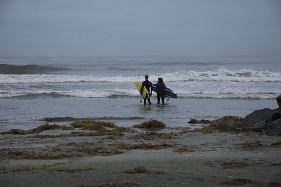
Here is the beginning RAW photo I took on an overcast day in San Diego. The lighting was flat, the sky was gray and the photo was pretty unimpressive.


B-O-R-I-N-G.


I used the Action Set “Colorful” here, but also adjusted the photo by adding a lot of cyan to the sky and ocean.


This is using the Vintage Action Set. I also adjusted the darkness layer, adding a little bit more exposure.


I liked the Seventies Action Set for the most part. It left the photo a little bland in my opinion.


Still using the basis of the Seventies Action Set, I added a little more cyan hue to the photo and darkened the edges of the photo. I liked this option the best.


However, comparing any of these Action Sets to this original photo is an improvement, no matter what. Do you have favorite Action Sets? How would you have edited this photo?


Read more

Color Saturation and Contrast

Using Photoshop, I did a few quick little fixes to the following two photos. It didn’t take me more than a few minutes to have a product that I was happy with.

I boosted the saturation and increased the contrast and…..


Voila! The flowers petals emerging from the cactus are much more dramatic in this revamped shot. And you know that I am a fan of the dramatic…
Let’s look at another example, using the same basic steps.


This photo is flat, lifeless…but once you boost the saturation and add a little contrast….


The colors leap from the photo, as God intended them to do. Or at least I think He would approve.
I am kind of speaking for the most important Being in the whole world. I don’t know if I have the right to do that. I’d better watch myself.

Read more

Selecting & Adjusting using the Inverse Function

I wanted to use two different effects with this photo.
I thought a diffuse glow action would soften the flower petals and a sharpening action would bring out the muted leaves that are lost in the background.

The color (and my overall interest) was lacking in this blah photo.


After boosting the saturation and the brightness of the photo, I used my ‘magnetic lasso’ to draw around the hydrangeas.
The magnetic lasso has become my new best friend. It makes it so easy to draw around crazy objects such as these flower petals.


After my whole hydrangea bunch was lassoed, I chose the diffuse glow function under the ‘filter’ tab.


I toned down the ‘glow amount’ so as not to overpower the photo with too brightly lit flower petals.


I boosted the saturation on the hydrangeas to draw out the details of the petals.


Happy with the look of the hydrangeas, next I focused on the background. With my magnetic lasso still active, I right clicked on the picture and chose to ‘select inverse’.


This makes the entire area, minus the hydrangeas active. Now, I can adjust anything in the background, separate from the flowers.


Under the ‘filter’ tab, I clicked on ‘sharpen’ and over to ‘sharpen’ again.


I wanted the leaves to stand out a little more, and so I boosted both the brightness and the contrast of the background.


And here is the final product.
Below is the before. If you’re into that ‘comparing’ kind of thing.

Read more

Extrude, Dude

Taking a simple photo, I wanted to see what the ‘extrude’ function would do to it.
This is the final product using a couple of simple steps.

Watch out-it’s comin’ at ya.
Below is the original photo.


B-o-r-i-n-g.
Let me tell you how I made the final photo with a few simple key strokes.


First, I made a background of the photo in Photoshop. I cropped it down to just the two basic firework explosions and boosted the contrast. Then, I got crazy. Clicking on the ‘Filter’ tab, I scrolled down to ‘Stylize’ and over to ‘Extrude’.


I don’t normally mess around with the ‘Extrude’ feature. When I had in the past, it made me think of Max Headroom and the 80’s in the not cool sense of the word. I tried out the ‘blocks’ option first.


Pretty cool, I suppose. But, I wanted to see what the ‘pyramid’ option would do for me.


I chose the ‘pyramid’ option and decreased both the pixels and the depth of the pyramids.


Well, isn’t that just purty? Let’s take this one step further.


Clicking on the ‘filter’ tab, I chose the ‘filter gallery’.


I tried several different filters, settling on the ‘fresco’ filter. You can see the brush size, detail and the texture I settled on as well, after messing around with the sliders.


Surreal.

Rebekah likey.

Read more