Tag Archive for: lightroom

Using Presets & Burning in Lightroom

This picture is cute, yes. But, let’s make it cuter.

Using Lightroom, I first made a copy of the photo so that I could mess with it by going to the “Photo” tab and clicking, “create virtual copy”.



I then used the Lightroom Preset, “Creative-Cold Tone”. But if you’ll notice, the sand and the concrete barrier are too bright.
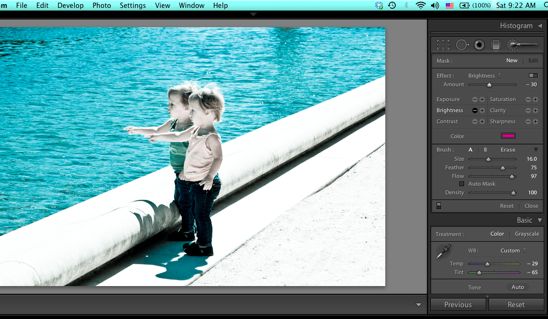
 

I clicked on the “Adjustment Brush”, chose the “-” sign on “brightness”.
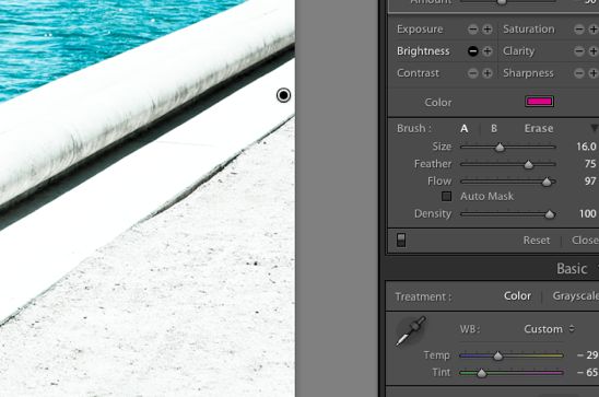
 

I increased my brush size to 16, decreased the feather to 75 and the flow to 97. I then “brushed” over the bright spots on the photograph.
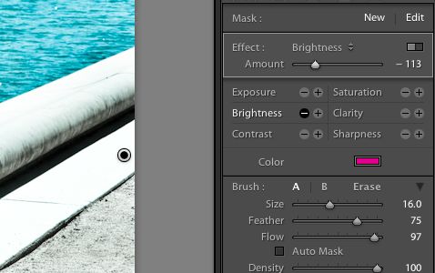
 

After decreasing the brightness to -113, the sand and the concrete was now at the correct exposure to match the rest of the picture.

 

Here’s the final picture. Those kids are too dang cute.

Read more

Snaptures Changes!

Since January, I haven’t been able to blog for any of you. My website seemed to die overnight and I was left to pick up the pieces. After many months of trying to repair it on my own-unsuccesfully, then moving into the realm of hiring someone to build my site, and then many more months of manually importing all of my old posts…I now have a functioning website.


During the interim, I didn’t forget my passion and continued prepping for the day that I would blog again.


Camera by my side, I kept shooting, waiting for the day to be near you once more in cyberspace.


So, here’s a little of what happened while we’ve been apart:


I have been photographing couples, families, babies…and of course, this cute dude with his guitar.


I’ve been busy writing my column, “Together in Tulsa” which is featured online and in print with This Land Press. I’ve been able to meet so many wonderful couples, learn their stories through interviewing them, and of course photograph each one.


Of course, with two new kitties in the house, I’ve been busy photographing their antics. They are “heck on wheels” according to several sources. However, I think they are cute as all get out. Even when they give me a “drive-by-catting”-for no reason.


Lastly, I’ve been using different filters, effects and processes. Biceps is usually my guinea pig.


I will be covering several tutorials, sharing my latest portraits and links to my writing and published photographs. I can’t wait to see what creative shots you have come up with since I’ve been gone!

Read more

Vintage Feel using Lightroom

I love to be creative with my frugality.
I bought a ream of gray paper for $15 and employ its simplicity when making my own personalized stationary.
I print off photos that I have taken to decorate the front of the cards, adding my own weirdo slogan to suit the recipient.

This shot was taken in a bowling alley one evening whilst I played amongst the friends.
I have been reading King James a lot lately. Forgive me.


I used the ‘Cold Tone’ preset in Lightroom to give this photo its vintage edge. I decreased the exposure in order to see the floor and increased the contrast in order to make out the chair pedestals.
I love how worn out and soft the print now appears.


I ended up going with the ‘Aged Photo’ preset. I decreased the exposure a little, but liked how washed out the floor appeared with this preset.
Simple. Cute.
That’s what I’m into and Lightroom is the answer on these occasions. Don’t get me wrong, I love Photoshop. But sometimes, you just want to quickly edit and be done with it.
This was such an occasion and it worked perfectly.

Read more

Using Lightroom Presets

Once in awhile on tour, I have just a minute to edit a photo and publish it, or possibly be away from the internet for days. I typically don’t use presets in Lightroom, but they do come in handy in these instances.
Here are a few quick examples of what those presets can do.

This is the original photo.


I like to import most of my photos using the preset, ‘Strong Contrast’. It gives a punch to the color in the photo and offers deep blacks.


This preset, ‘Creative: Selenium Tone’, adds the retro black and white feel with sharp contrast and a hint of blue.


I love this preset, ‘Creative: Direct Positive’.
It’s a nod to high fashion photography: a yellow hue is added to green, both the color and the lighting is intensified, and it strikes a sharp contrast between blacks and whites.


Using the preset, ‘Creative: Aged Photo’, you can turn a modern photo into something reminiscent of the past, but with sharp detailing and deeper blacks.
I like to mess around with my presets-adding color filters or increasing exposure just to see what craziness I can come up with. It’s really fun to do with portraits.
I hope this inspires you to have fun in Lightroom when your time is short and you can’t get into an intense photoshop edit!

Read more