Tag Archive for: century farm

Current Remodel-Past, Present & Blown Up

Yes, two front doors again. We like to confuse people-especially delivery guys.

Our realtor called this house another ‘turd’.
I love our realtor. She is so truthful.

This poor house had been made into a mockery of a home. Something had to be done.


We basically had to tear it down to build it back up. Just like the army. Go Army! Go Greimans!

ONE MOMENT FOR:
A few weird facts about this house….
1.One entire bedroom and bathroom (including the ceiling) had been painted mauve and pepto pink.
2.The electrical panel had two inches of water sitting in it. YIKES!
3.After closing, we found a second secret electrical panel that even the inspector missed. Double YIKES!
4.We pulled up a brick pattern linoleum in the kitchen to find….the exact same brick pattern linoleum underneath it. What the heck?

But what takes the proverbial cake was that this house had FIVE exterior doors. Now, you know my stance on buying houses with at least two front doors. But do we really need five? We removed a couple, just for fun.


This one…


…and this one. Pay no attention to that man. I have no idea who that man is.


Now, a little twist. See this pretty barn? (Stick with me, I promise this has something to do with our current remodel.) My hubby grew up on this farm. His Grandma Greiman grew up here, and so did her father. The farm & the barn were built in the 1800’s. It has seen horse and buggies, flapper dresses, the Great Depression, World War I & II, telephones, airplanes, men on the moon, the Vietnam War, hippies, the internet…

I think you get the idea. It’s been around awhile.


The barn resides on the Greiman farm, which is referred to as a ‘Century Farm’. It’s been in the same family for over 100 years.


This is the haymow of said barn where generations of farmers stored their hay. And did other things in the haymow that maybe you shouldn’t be doin’. Wink, wink.


The barn was built with wooden pegs to hold it together instead of nails. The supporting beams had roman numerals carved into them, allowing the barn raisers to know which beam went where. The barn raisers handiwork survived tornadoes and fires and storms.


But, one summer we had to tear it down. That wasn’t easy for any of us.


Especially for these two: Kayle’s Grandpa and Grandma Greiman. They came by often, since they only lived four miles away, bearing cookies and ice cream and watching our progress.


Although much loved, the barn had become unsafe. This is one of the four corners of the barn. Notice it’s leaning on a little iron peg-and that’s all it’s leaning on.


We were able to recycle and save as much of the barn as possible. The foundational rocks are now in my garden. The haymow floor….


….is the flooring in most of our house. It was a pretty nasty sanding process, releasing 100 year old barn-ness into the air-but totally worth it.


The floors are my favorite part of our home. It’ll be hard to ever leave.


We made a ridiculously huge dining room table out of the barn’s stable wood. We can comfortably seat 10, and squeeze in 12 if need be. I wanted it wide enough for our plates and a huge amount of food in the center. Both sides of the family are big eaters…


This is one of the four legs to our dining room table. Notice the roman numeral carved into it?

But enough about that.
Let’s talk about injuries.


During ‘Insulation Day’, this guy Beau (who blew up another of our houses) decided to get creative. Anytime Beau gets creative, someone is going to get hurt.

He set about making a prop out of scrap wood to hold up the insulation that I was stapling to the ceiling. And sometime during the process….he shot a 16 penny nail through his finger. If you don’t know what a 16 penny nail is, it’s about 2 inches long.

Things I won’t repeat began to creep from Beau’s lips. I thought he was pulling my leg and had taped the nail to the backside of his finger. I told him to quit goofing off and get back to work.

Hubby took Beau to the hospital instead, nail and all. Big oops on my part.


But then, what do you expect from someone that looks like this and who sniffs paint fumes, old dust and fiberglass all day?
You shouldn’t expect much, let me tell you. Just pour her a glass of wine and call it a day.

Read more

Hue, Saturation and Lens Flare

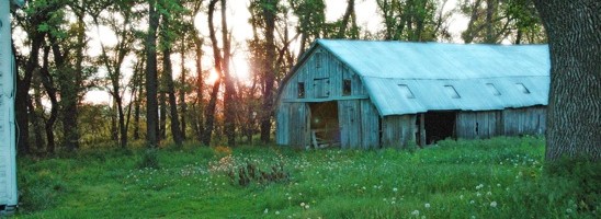
Serenity oozed out of this photo. It is peaceful, allowing me to reminisce about the farm.
However, I wanted to spruce it up a little.

After making a copy, I wanted to add a little Diffuse Glow.


Under the Filter Tab, I scrolled down to Distort and then over to Diffuse Glow. I adjusted the amount of graininess to 4%, glow to 7% and clear amount to 12%.


I clicked on the Image tab and scrolled down to Adjustments, then over to Brightness/Contrast.


I used the sliders to increase both the Brightness and the Contrast.


I wanted the grass to pop a little more. Clicking on the Image tab again, I scrolled down to Adjustments and then over to Hue/Saturation.


I used the sliders to increase the saturation and decrease the hue. This brought out a depth in the green grass that made me happy. I smiled from ear to ear, that’s how happy I was.


I wanted the photo to have a little something special, however.
Opening the Filter tab, I scrolled down to Render and then over to Lens Flare.
I tried all of the different ‘Lens Types’, choosing to go with the 50-300 mm Zoom. I chose a brightness of 56% which wouldn’t allow the Lens Flare to overpower the photo.


Here’s the final photo all spruced up. And below is what I started with.

Read more

Lighting Effects to Enhance a Photo

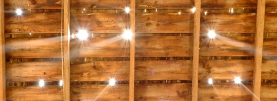
This picture was shot the summer we tore down the barn on the Greiman farm.(If you want to know more about that, check out Current Remodel.)
It makes me think heaven is peaking through the holes in the roof of the haymow.

I liked the shot, but it needed a little pizzazz, a little boost.
Presently, I am using Adobe Photoshop CS-the orginal version, since my computer crashed. I have to use what Hubby has on his computer. The program is pretty similar to the newer versions, but not totally up to date.

First things first when using Photoshop:
Always make a background copy of your image. Always. Do this before you do any adjusting and you will not harm your original picture.

You can make a copy by:
On the lower right hand side of the program, you will see a box with the tabs labeled ‘layer’, ‘channels’ and ‘paths’.
Under the tab ‘layer’, you will see your image as a tiny thumbnail labeled ‘background’ with an eyeball to the left of it and a padlock to the right of it.
Place your cursor on the tiny thumbnail and drag it down towards the bottom, landing it on the icon that looks like a tiny page with a dog-eared corner. This icon is labeled ‘create a new layer’ if you allow your cursor to just rest on it.

Now that we’ve made a copy, we can make our adjustments without hurting the original image forever.
Make sure there is a tiny paintbrush to the right of your background copy. The paintbrush means you are making adjustments to the copy and not the original.


Next, I used some lighting effects. The overall shot had a very even light, and I thought it would create some visual interest to vary the point of light a little bit.

Under ‘Filter’ in the top menu bar, highlight the word ‘Render’ and then move your cursor over to highlight and click on ‘Lighting Effects’.
I chose the ‘default’ style at the top. I then chose the ‘light type’ as ‘omni’ and increased the diameter of the circle until just the four corners were on the outside of the circle. Make sure the ‘light type’ box has been checked to be in the ‘on’ position. I moved the ‘intensity’ up to a level of 23.
Under ‘properties’ I left the ‘gloss’ at 0, moved the ‘material’ to a level of 69, the exposure to a level of 4, and the ambience to a level of 13.

Notice how the center of the picture is now lighter, leaving the corners a little darker?


I wanted to adjust the contrast a little to
make the details in the wood stand out.

Under ‘Image’ in the top menu bar, highlight the word ‘Adjustments’ and then move your cursor over to highlight and click on ‘Brightness and Contrast’.
I left the ‘brightness’ at a level of 0 (because it was already plenty bright), but adjusted the ‘contrast’ to +12.

The wood now pops a little more.


Next, I ‘sharpened’ the photo.

Under ‘Filter’ in the top menu bar, highlight the word ‘Sharpen’ and then move your cursor over to highlight and click on ‘Sharpen’.

The light beams are a little more focused now and the wood is more crisp looking.


Lastly, I increased the shadows and the highlights a tiny bit to bring out the depth of the photo.

Under ‘Image’ in the top menu bar, highlight the word ‘Adjustment’ and then move your cursor over to highlight and click on ‘Shadows and Highlights’.
I increased the ‘shadow’ to 15 and the ‘highlight’ to 12.

The dark parts of the photo are a little darker, the bright parts of the photo are a little brighter.

Above is the final version of my barn picture.
And below is the original so you can compare.

Read more