Lighting Effects to Enhance a Photo
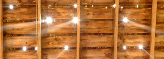
This picture was shot the summer we tore down the barn on the Greiman farm.(If you want to know more about that, check out Current Remodel.)
It makes me think heaven is peaking through the holes in the roof of the haymow.

I liked the shot, but it needed a little pizzazz, a little boost.
Presently, I am using Adobe Photoshop CS-the orginal version, since my computer crashed. I have to use what Hubby has on his computer. The program is pretty similar to the newer versions, but not totally up to date.
First things first when using Photoshop:
Always make a background copy of your image. Always. Do this before you do any adjusting and you will not harm your original picture.
You can make a copy by:
On the lower right hand side of the program, you will see a box with the tabs labeled ‘layer’, ‘channels’ and ‘paths’.
Under the tab ‘layer’, you will see your image as a tiny thumbnail labeled ‘background’ with an eyeball to the left of it and a padlock to the right of it.
Place your cursor on the tiny thumbnail and drag it down towards the bottom, landing it on the icon that looks like a tiny page with a dog-eared corner. This icon is labeled ‘create a new layer’ if you allow your cursor to just rest on it.
Now that we’ve made a copy, we can make our adjustments without hurting the original image forever.
Make sure there is a tiny paintbrush to the right of your background copy. The paintbrush means you are making adjustments to the copy and not the original.

Next, I used some lighting effects. The overall shot had a very even light, and I thought it would create some visual interest to vary the point of light a little bit.
Under ‘Filter’ in the top menu bar, highlight the word ‘Render’ and then move your cursor over to highlight and click on ‘Lighting Effects’.
I chose the ‘default’ style at the top. I then chose the ‘light type’ as ‘omni’ and increased the diameter of the circle until just the four corners were on the outside of the circle. Make sure the ‘light type’ box has been checked to be in the ‘on’ position. I moved the ‘intensity’ up to a level of 23.
Under ‘properties’ I left the ‘gloss’ at 0, moved the ‘material’ to a level of 69, the exposure to a level of 4, and the ambience to a level of 13.
Notice how the center of the picture is now lighter, leaving the corners a little darker?

I wanted to adjust the contrast a little to
make the details in the wood stand out.
Under ‘Image’ in the top menu bar, highlight the word ‘Adjustments’ and then move your cursor over to highlight and click on ‘Brightness and Contrast’.
I left the ‘brightness’ at a level of 0 (because it was already plenty bright), but adjusted the ‘contrast’ to +12.
The wood now pops a little more.

Next, I ‘sharpened’ the photo.
Under ‘Filter’ in the top menu bar, highlight the word ‘Sharpen’ and then move your cursor over to highlight and click on ‘Sharpen’.
The light beams are a little more focused now and the wood is more crisp looking.

Lastly, I increased the shadows and the highlights a tiny bit to bring out the depth of the photo.
Under ‘Image’ in the top menu bar, highlight the word ‘Adjustment’ and then move your cursor over to highlight and click on ‘Shadows and Highlights’.
I increased the ‘shadow’ to 15 and the ‘highlight’ to 12.
The dark parts of the photo are a little darker, the bright parts of the photo are a little brighter.
Above is the final version of my barn picture.
And below is the original so you can compare.


