Archive for category: Photo Shoots

Hue, Saturation and Lens Flare

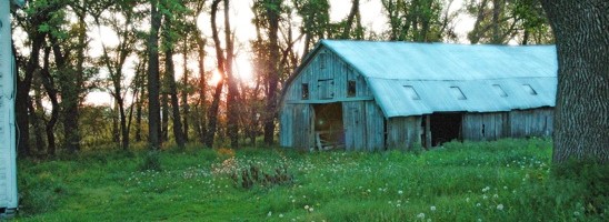
Serenity oozed out of this photo. It is peaceful, allowing me to reminisce about the farm.
However, I wanted to spruce it up a little.

After making a copy, I wanted to add a little Diffuse Glow.


Under the Filter Tab, I scrolled down to Distort and then over to Diffuse Glow. I adjusted the amount of graininess to 4%, glow to 7% and clear amount to 12%.


I clicked on the Image tab and scrolled down to Adjustments, then over to Brightness/Contrast.


I used the sliders to increase both the Brightness and the Contrast.


I wanted the grass to pop a little more. Clicking on the Image tab again, I scrolled down to Adjustments and then over to Hue/Saturation.


I used the sliders to increase the saturation and decrease the hue. This brought out a depth in the green grass that made me happy. I smiled from ear to ear, that’s how happy I was.


I wanted the photo to have a little something special, however.
Opening the Filter tab, I scrolled down to Render and then over to Lens Flare.
I tried all of the different ‘Lens Types’, choosing to go with the 50-300 mm Zoom. I chose a brightness of 56% which wouldn’t allow the Lens Flare to overpower the photo.


Here’s the final photo all spruced up. And below is what I started with.
Read more

Modern Engagement with a Vintage Feel

Today, I am highlighting one of my favorite photographers, Justin Greiman.
(He also happens to be my Hubby’s brother.)
Justin shoots bands, babies, weddings and everything in between. His patient and humble approach to his clients is earning him a reputation not only as a great photographer, but also as a great guy to work with.
Plus, his photos pretty much rule.

Justin recently shot this series for this couple’s engagement. I love the deep saturation of color, the vintage feel, the hat-tipping to a time when men mowed the grass in a tie and women wore heels while cooking.
My hubby is lucky to see me outside of lounge pants.

(Justin shot all of these with a Nikon D90 at ISO 400. He used 28mm and a 50mm lenses for this shoot. He used partially available light, with a little fill from one sb800 in a 15″ softbox. He edited them in Lightroom using Color Efex Pro 3.0, a plugin from Nik Software.)


Justin captured a story with these next three shots. They intrigue me and I want to know more.


She seems pretty upset about something.


Her anger turns to sass, which is what mine usually does as well.
I get her.


His arms crack me up. They sell the vintage feel of the shot, as does the yellowed effect.
She looks perfectly posed; just like a print ad from the 60’s.


Could they be any more cute? Doubt it.


This is one of my favorites from the entire shoot. The mood draws you in, the graininess of the portrait softening the shot. It seems intimate, as if you are seeing a small snippet of their life that no one else gets to see.
Thank you Beau and Chrissie for allowing me to show off your engagement pictures. And congrats on the upcoming wedding!
And thank you Justin Greiman for taking such wonderful pictures. Go check him out-he’ll blow your little socks off!

Read more

Unconventional Photos

Making your subject at ease can be tough. I like to put the client in a familiar setting or position to help them relax. My subject was most at ease doing this-blowing a bubble.
Isn’t he just the cutest?

I liked the photo, but there were a few things that needed a fixin’. (That’s Okie talk…)


I didn’t like the chair sticking into the frame. I made a copy of the background and then cropped out the offender.


His skin looked a little flat, so I used the ‘diffuse glow’ function. It’s very flattering to skin tones-boys and girls alike.


He looks so darn purty now. But don’t tell him. He is very macho.


The overall color was too brown for me. I adjusted the levels using ‘color balance’ (found under the tab ‘Image’ and scrolling down to ‘adjustments’).


His eyes needed to pop a little more, so I lassoed both of those cute little suckers and clicked on the ‘Filter’ tab. Scroll down to ‘Sharpen’ and then choose ‘unsharp mask’ and adjust the amount, the radius and the threshold to your liking.
I learned this from Pioneer Woman. I like her. And her photo tricks.


Next, I wanted the bubble gum to stand out a bit more. I lassoed it and then clicked on the ‘Image’ tab and scrolled down to ‘Hue and Saturation’. I brought out the pink in the gum a little more.


Here is the cute finished product. I just love this little guy. However, he is my nephew after all, and I am a little biased.

Read more

Flattering Portrait Effects-Lens Flare & Smoothing

This little angel was a downright blessing to shoot this past drizzly Saturday morning.
She was compliant, quiet and naturally beautiful.

The rain drew out of the vibrant greens in the English garden. I was in photography heaven.


I wanted to add a little visual interest to the photo with a lens flare. Under the filter tab, scroll down to render, then over to lens flare.


Move this cross to where you want the focus of the lens flare to be. Increase/decrease the brightness to what your little heart desires.


Here’s what the lens flare looks like once it’s applied to your picture. The flare inspired me to push the image to a more dreamy look. Let’s play with the ‘diffuse glow’ function again.


You’ll find this function under ‘filter’, scrolling down to ‘distort’ and then over to ‘diffuse glow’.


This will pull up a preview screen. You can adjust the graininess, the glow and the clear amount. The preview will adjust a portion of you image as you move the sliders around.


On the right hand side, where your layers are visible, you can adjust both the opacity and the fill of the diffuse glow. Move your sliders up & down until you are happy with your image.


This is how the diffuse glow looked once it was applied to my image. Isn’t she precious?


I wanted to smooth out the fly-aways in her hair. Using my magic lasso, I drew around both sections of her hair. You can lasso more than one area by holding down the shift key as you draw.
To blur her hair, click on the ‘filter’ tab, scroll down to ‘blur’ and then over to ‘gaussian blur’.


I chose a radius of 7.0 to ‘blur’ her hair. Goodbye fly-aways.


Here’s the final product that I sent off to the client.
Below is the ‘before’ photo for your comparing pleasures.

Read more