Archive for category: Snaptures

Extrude, Dude

Taking a simple photo, I wanted to see what the ‘extrude’ function would do to it.
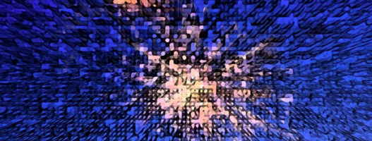
This is the final product using a couple of simple steps.

Watch out-it’s comin’ at ya.
Below is the original photo.


B-o-r-i-n-g.
Let me tell you how I made the final photo with a few simple key strokes.


First, I made a background of the photo in Photoshop. I cropped it down to just the two basic firework explosions and boosted the contrast. Then, I got crazy. Clicking on the ‘Filter’ tab, I scrolled down to ‘Stylize’ and over to ‘Extrude’.


I don’t normally mess around with the ‘Extrude’ feature. When I had in the past, it made me think of Max Headroom and the 80’s in the not cool sense of the word. I tried out the ‘blocks’ option first.


Pretty cool, I suppose. But, I wanted to see what the ‘pyramid’ option would do for me.


I chose the ‘pyramid’ option and decreased both the pixels and the depth of the pyramids.


Well, isn’t that just purty? Let’s take this one step further.


Clicking on the ‘filter’ tab, I chose the ‘filter gallery’.


I tried several different filters, settling on the ‘fresco’ filter. You can see the brush size, detail and the texture I settled on as well, after messing around with the sliders.


Surreal.

Rebekah likey.

Read more

Toning down the Reds

I shoot with a Nikon and have noticed a re-occurring problem with the red hues in my photos.
They are crazy bright and overwhelming.

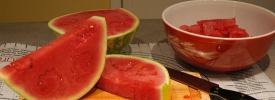
I decided to do a little test with this watermelon picture. Notice how almost unrealistic the red looks.


‘Agh! The reds are hurting my eyes! Do something!’


Using the ‘Magic Wand’ tool, I separated all of the red from the rest of the colors in the photo.


I clicked on the ‘Image’ tab, scrolled down to ‘Adjustments’ and over to ‘Photo Filter’.


Typically adding blue to red will mute it a bit. I chose to use a deep blue filter to tone the ‘SHAZAM’ down.


Here’s the after with the red muted a little. And below is the before.

Read more

Holy Cute Pudginess

Softening Harsh Light & Removing Imperfections with Photoshop
I have five super cute nephews. No nieces, just nephews.
(I guess it’s up to me to produce some females in this family.)

I love to photograph my cute little nephews any chance I get.
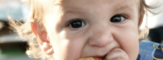
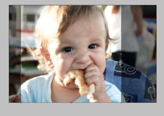
This little guy, the youngest of my five nephews, can instantly melt your heart with those sweet dark brown eyes.This straight out of the camera shot was a little dark, however. And the background had too many distractions in it. Using photoshop, I did a little quick fixer-upper.


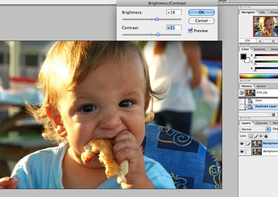
After making a background copy, I clicked on the ‘Image’ tab and then to ‘Adjustments’. I chose to increase the brightness and the contrast of the photo just a smidgen.
Now you can really see those cute pudgy cheeks.


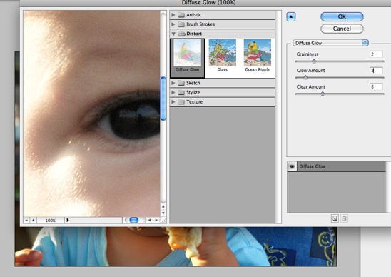
I wanted to soften the harsh sunlight cast on the left side of his face. Clicking on the ‘Filter’ tab and then down to ‘Distort’, I chose the ‘Diffuse Glow’ function. I played with the sliders until I was happy with my image.
The ‘Diffuse Glow’ is rather flattering to skin tones. I recommend it for your portraits.


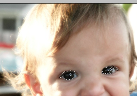
His eyes were still a little too dark for me. I wanted to try and make them pop, even though they are a dark brown naturally.
Using the lasso on the left hand side, I drew around his eyes. I then went to the ‘Select’ tab and clicked on ‘Modify’ and chose to first ‘Expand’ my selection. Then I chose ‘Smooth’ in the same tab.


For this next function, I have to give props to Pioneer Woman.
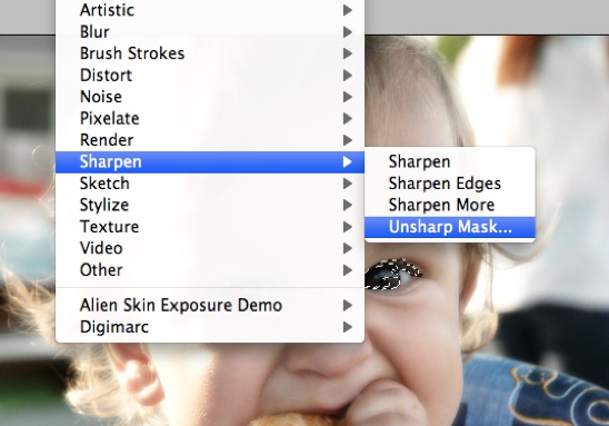
With his eyes selected, I clicked on the ‘Filter’ tab, scrolled down to ‘Sharpen’ and then over to ‘Unsharp Mask’.


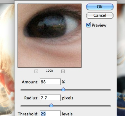
You can see the amount, the radius and the threshold that I chose to increase the brilliance of his eyes.
You can play with these sliders until you like the look of your eyes. But, don’t get crazy-you can make people look possessed if you go too far….


I decided next to tone down on all of the distractions behind his cute little face by cropping the photo.


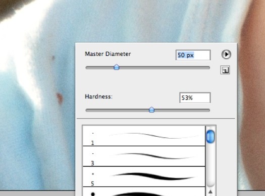
Now it was time to get rid of the tiny imperfections. I chose the ‘clone’ tool on the left hand side and cloned out the food particles on his shirt.


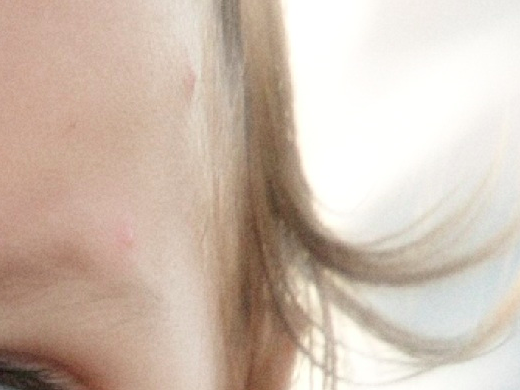
And then I ‘cloned’ out the baby acne on the right side of his face.


This is the ‘after’ with just a few quick fixes. And below is the ‘before’.
But, he’s just so dang cute, no matter what I do.

Read more

Hue, Saturation and Lens Flare

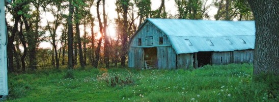
Serenity oozed out of this photo. It is peaceful, allowing me to reminisce about the farm.
However, I wanted to spruce it up a little.

After making a copy, I wanted to add a little Diffuse Glow.


Under the Filter Tab, I scrolled down to Distort and then over to Diffuse Glow. I adjusted the amount of graininess to 4%, glow to 7% and clear amount to 12%.


I clicked on the Image tab and scrolled down to Adjustments, then over to Brightness/Contrast.


I used the sliders to increase both the Brightness and the Contrast.


I wanted the grass to pop a little more. Clicking on the Image tab again, I scrolled down to Adjustments and then over to Hue/Saturation.


I used the sliders to increase the saturation and decrease the hue. This brought out a depth in the green grass that made me happy. I smiled from ear to ear, that’s how happy I was.


I wanted the photo to have a little something special, however.
Opening the Filter tab, I scrolled down to Render and then over to Lens Flare.
I tried all of the different ‘Lens Types’, choosing to go with the 50-300 mm Zoom. I chose a brightness of 56% which wouldn’t allow the Lens Flare to overpower the photo.


Here’s the final photo all spruced up. And below is what I started with.

Read more