Archive for category: Snaptures

The Ghost of Biceps

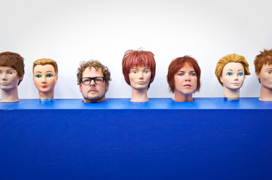
On this day, I thought it fitting to be a little spookier than usual. A little woo-hoo and what not.
One must ask oneself, is what I’m seeing about to see an apparition or perhaps a ghost? Is this the dreaded and feared “Farty Spirit of Biceps”?

Or could this be a simple slideshow built for my pure amusement?

You’ll never know, (insert evil laugh).

Read more

If you’re going to be a crab…..

I love using weird photos to make birthday or thank you notes. This photo caught my eye while I was perusing my library. I knew something good could come of it. Here’s a quick tutorial on turning a bland photo into something worthy of printing off….
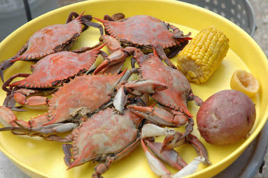
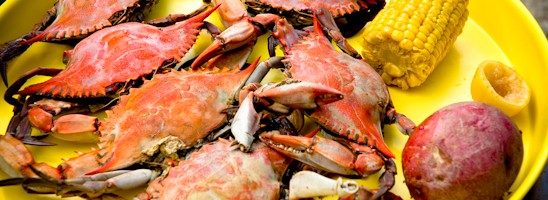
While on tour in Louisiana, we were invited to a crab boil. Here is my plate of food. No, I didn’t eat it all. I had some help from a certain Biceps.
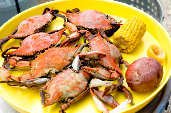
 

In Lightroom, I used the pre-set, “Direct Positive”. This tends to add a burst of color, contrast and interest to photos. However, when I’ve used it on humans it makes them look like Oompa Lumpa’s.
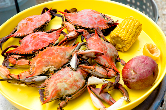
 

I slightly increased the red and yellow hues, and added a little saturation to it.
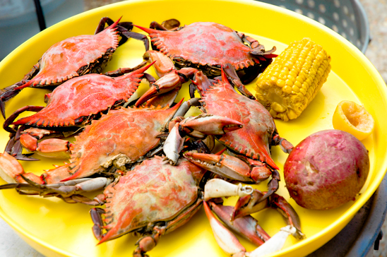
 

Next, I used the paintbrush function and decreased the clarity surrounding the yellow tray.
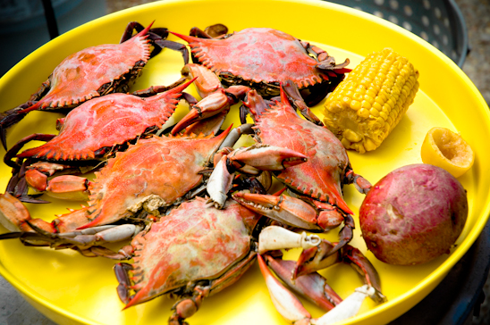
 

Lastly, I used the vignette function and lens corrected the photo, darkening the edges. Here’s the final photo-ready for action.
Read more

Using Presets & Burning in Lightroom

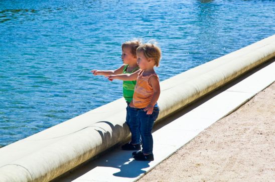
This picture is cute, yes. But, let’s make it cuter.

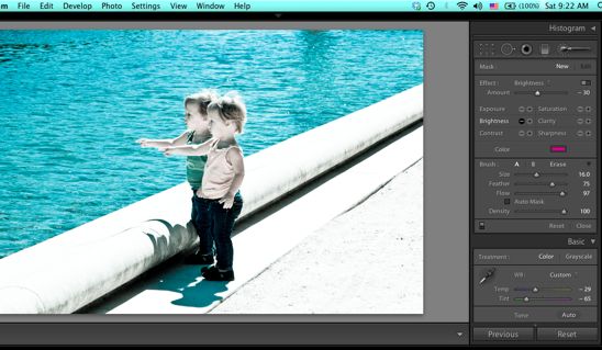
Using Lightroom, I first made a copy of the photo so that I could mess with it by going to the “Photo” tab and clicking, “create virtual copy”.


I then used the Lightroom Preset, “Creative-Cold Tone”. But if you’ll notice, the sand and the concrete barrier are too bright.


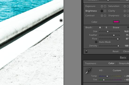
I clicked on the “Adjustment Brush”, chose the “-” sign on “brightness”.


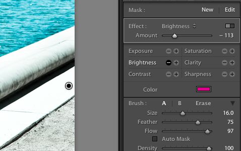
I increased my brush size to 16, decreased the feather to 75 and the flow to 97. I then “brushed” over the bright spots on the photograph.


After decreasing the brightness to -113, the sand and the concrete was now at the correct exposure to match the rest of the picture.


Here’s the final picture. Those kids are too dang cute.

Read more

The Latest Couple

I have a column called Together in Tulsa in the regional Oklahoma paper, “This Land Press”-which is both online and in print.

Writing this column is really the coolest job.

I get to invite strangers into my home, ask them all sorts of probing questions, dress them up in weird costumes and then photograph the incident. Later, when they’re gone, I sit around in my jammies and sip on a glass of red wine while I sort out all the information in order to write a story about them.

And, I get paid to do this.


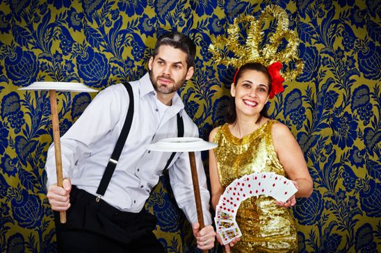
So, here’s the latest couple that I wrote about, Aaron and Jessica.
 

And there’s plenty more where that came from. But, I’ll let you in on a secret. I do have my favorite couples. Here are a couple of my favorites couples, coupled:

Jeff and Amber Whitlatch


And Stephen and Esther Hill.

If you have a few or more than a few minutes, read Together in Tulsa-I recommend sipping a glass of wine and wearing jammies as you do so.

Read more